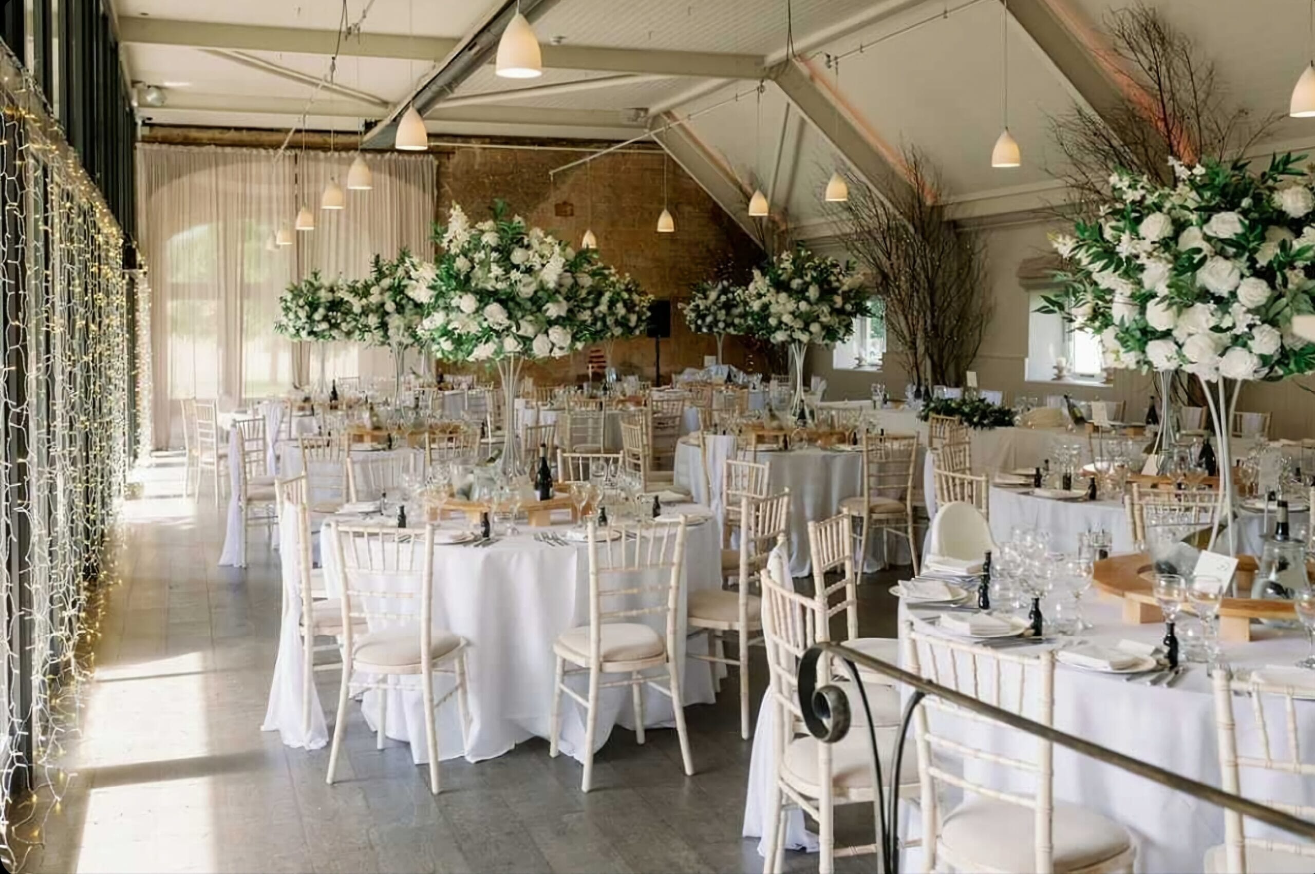
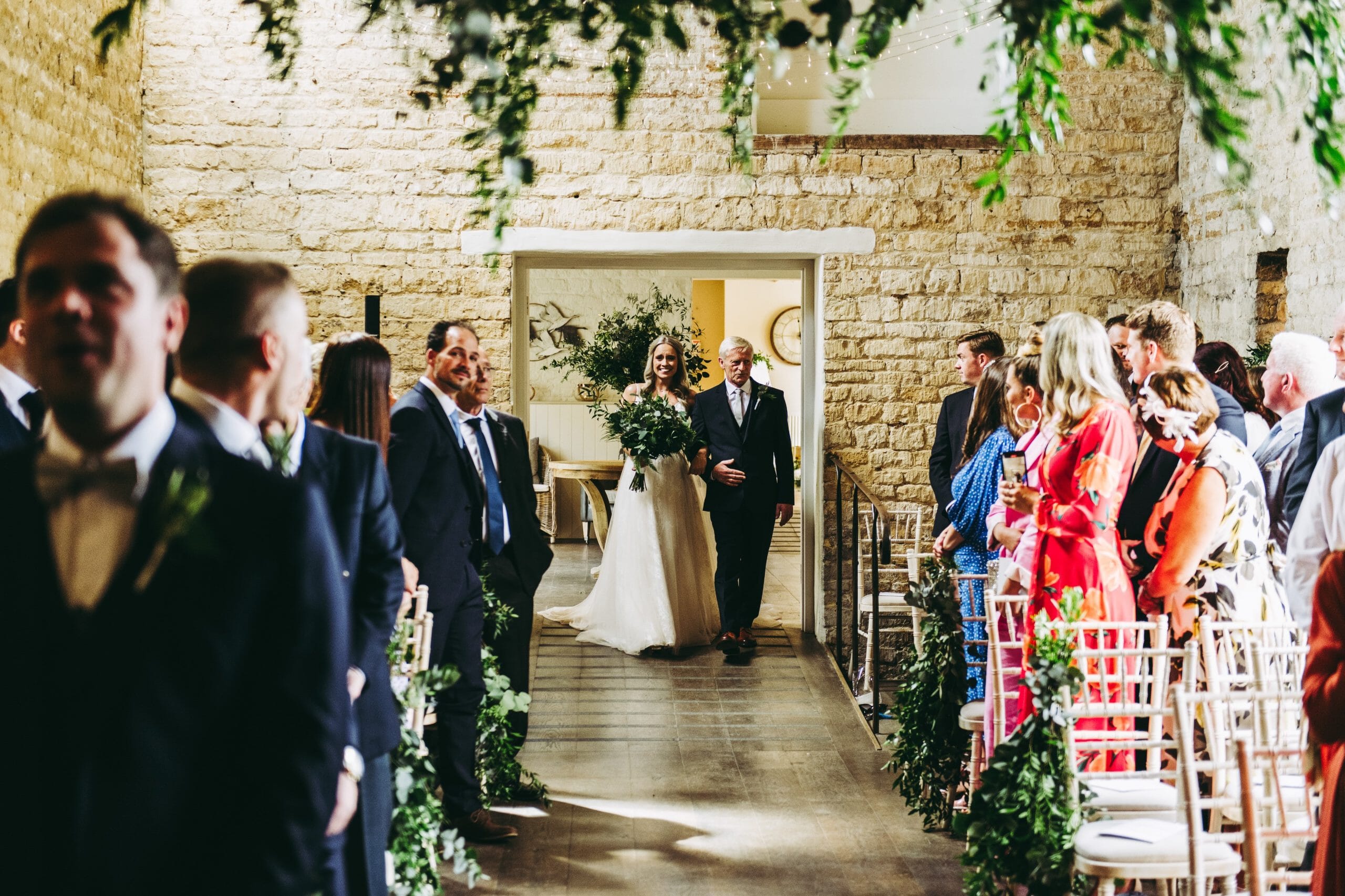
 I was astounded by the incredible views of luscious countryside that surround Lapstone Barn and I knew that I wanted to reflect this within the bespoke invitation design, without doing something very literal like a drawing of the barn. I wanted it to be customisable, and to replicate the elegant feel whilst also reflecting its rustic charm, as it just screams THE COTSWOLDS!
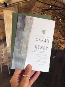
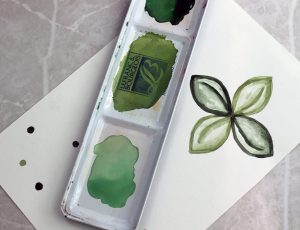
I used a mixture of processes to create these invitations; the first was the hand painting watercolour wash (down the left hand side), along with the hand painting of their iconic logo. The colours I chose were heavily inspired by the fabulous surroundings as well as the barn’s overall feel & branding….lots of earthy, rustic greens. When it comes to customising the suite, you can change the colours of this watercolour wash to match your own colour scheme.
 I absolutely love the fairy lights running down the trees inside the barn – it feels so magical and beautiful – and this inspired the foiling aspect of the design. The sporadic dots and markings that are foiled are an abstract depiction of these lights. The foiling also enhances the feel of a striking elegance of such a beautiful Cotswold wedding venue.
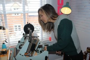
You can choose from silver, gold or rose gold foil, to match the styling of your wedding day. The foiling is individually hand printed at my little studio in the Cotswolds. It’s a lengthy, process but it’s definitely worth the end result- it gives the invitations depth, texture and that look unachievable via any other process.
 Get in with Retropress to chat about your bespoke wedding invitations – Kate’s contact details can be found here in our list of recommended suppliers
